Teldon
MY ROLE | typography, guideline, design, facilitating meetings, research, testing, creating brand exercises
In a CREATIVE TEAM with | Fatima Travassos, Ben Shum, Julian Coffee, Trisha Bernardo
Brand refresh for Teldon, a leader in personalized print products, specializing in personalized calendars. Teldon partners with some of the biggest automotive, financial, and real estate companies in North America such as Goodyear, McKesson, New York Life, GM and others.
Key Focus:
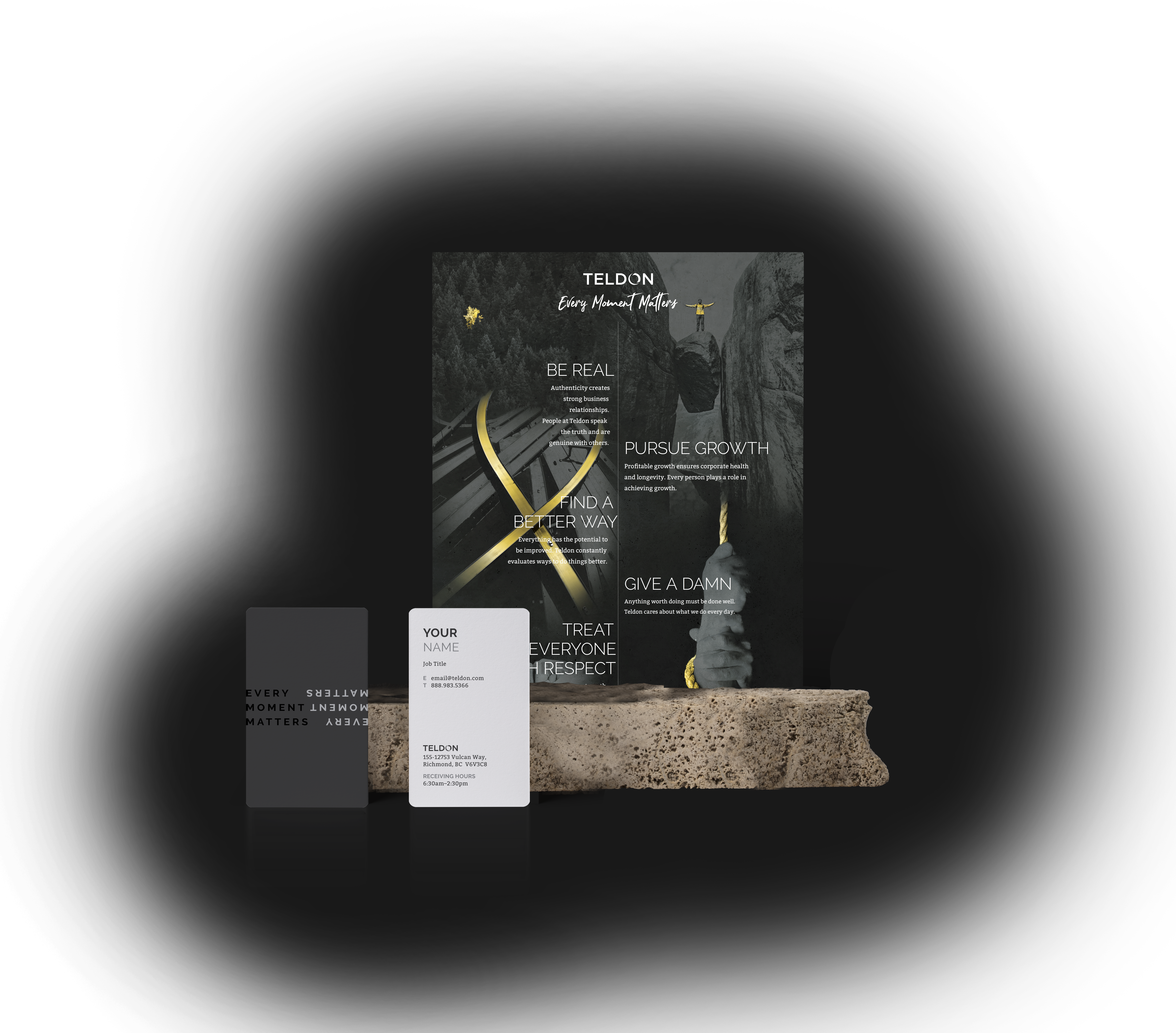
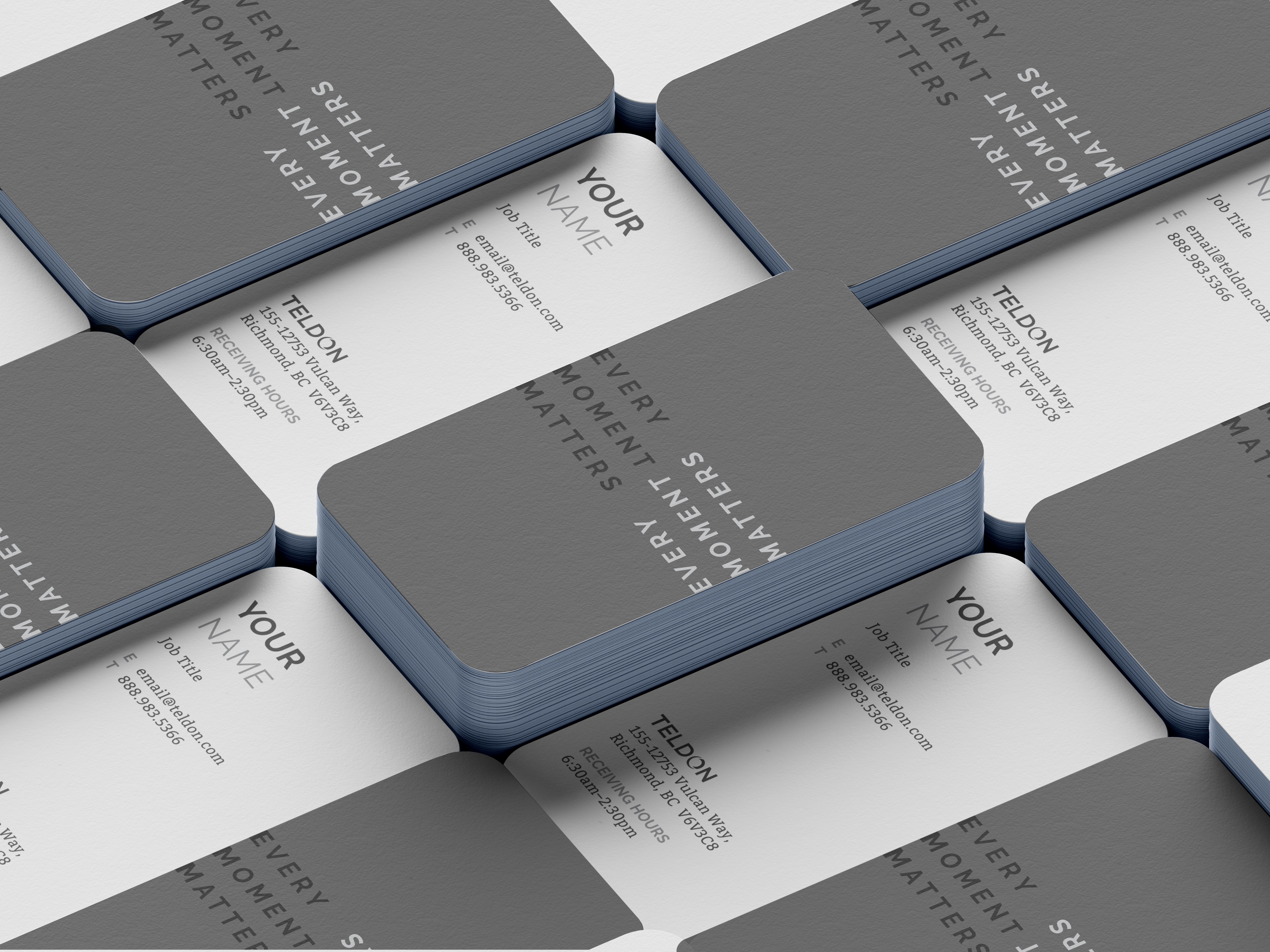
Infuse the brand with new vitality by elevating existing brand elements, while maintaining the recognition of the existing visual identity.
Challenge | Streamline and simplify the brand application within the company and create a unified corporate identity.
Outcome:
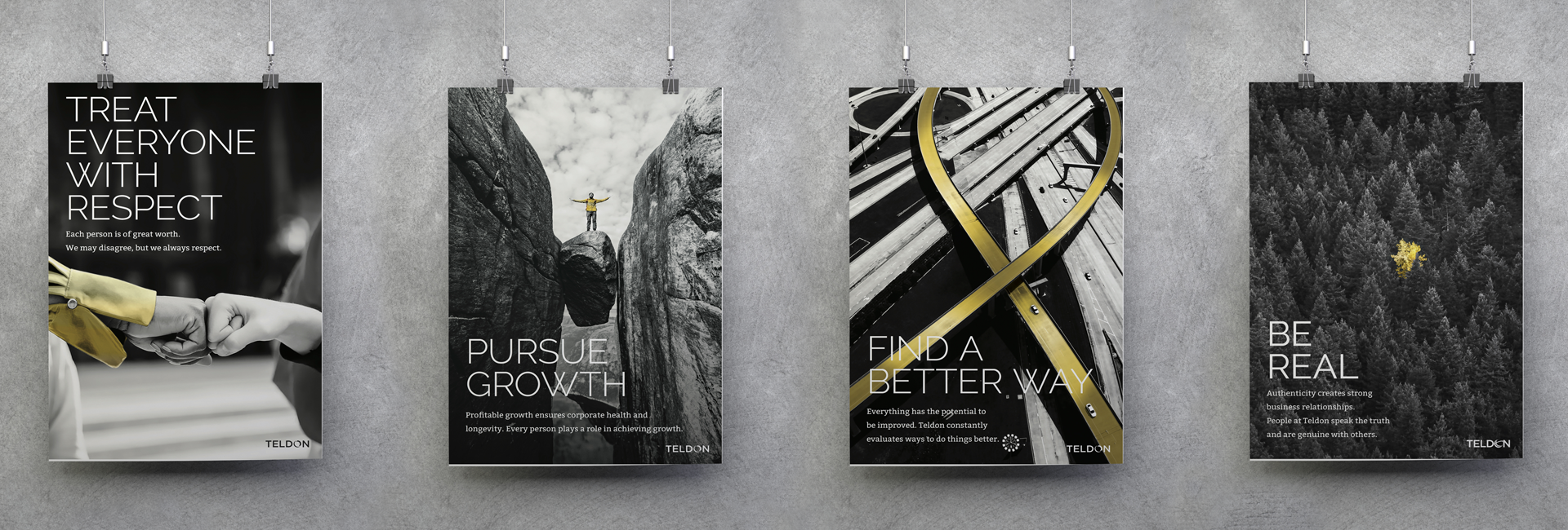
Being in business for 50 years, Teldon stands for relationships, tradition, and adaptability. We preserved the essence of core brand elements familiar within the industry, but refined them to fit better company contemporary practices and strengthen their image as a lasting leader in the industry.
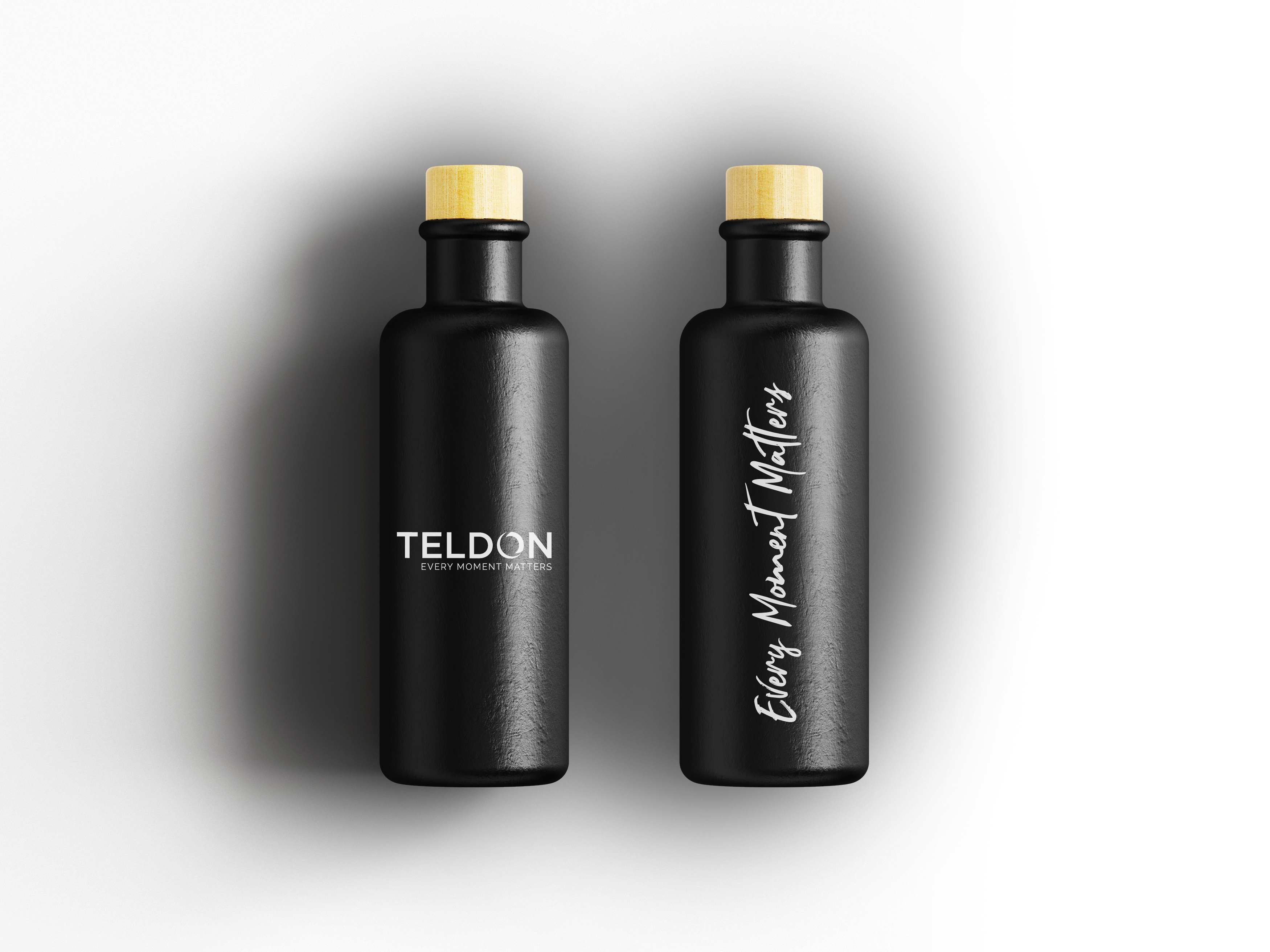
Logo | The redesigned “globe” symbol provides a more contemporary feel while the general aesthetics remain the same. Slightly intertwining the letter “o” retains the symbolic meaning of the globe - universality and continuity, as well as connectivity with people.
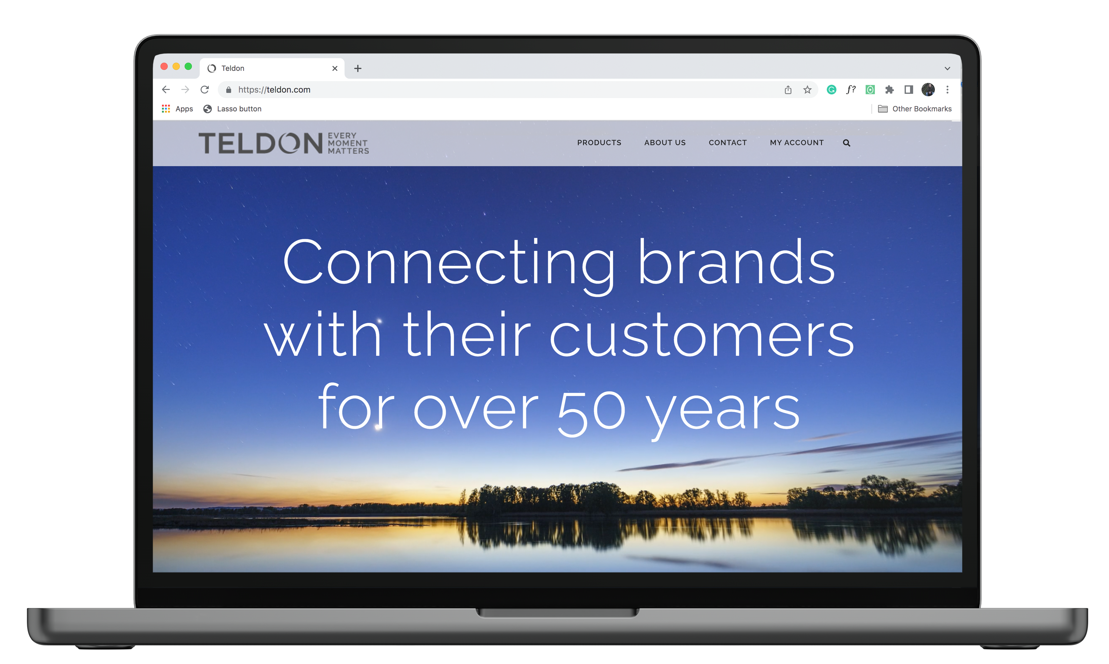
Typography | Established clear hierarchy with more sophisticated font choices, but technically easier to implement across all departments while retaining legibility.
Colours | Refreshed the core palette, and enlivened it with new accent colours to differentiate between internal versus external communications across creative departments.


Old Logo
New Logo





Portfolio

Raymond StoriesIllustration, Design, Print

Black MountainBranding, Illustration

Colouring BooksIllustration, Story, Design, Print

Music ArtworkArtwork, Design

Cole's Guitar LessonsBranding

PPRBRebrand

Corporate Calendar LineDesign, Illustration, Print

Themed CalendarsDesign, Illustration, Print

Johnston's PorkDesign, Illustration, Print

Employee ManualsDesign, Illustration, Print

Home By Design MagazineMagazine Logo
