PPRB
MY ROLE | Logo design, colour palette
Logo redesign for a recognized print-marketing partner for pharmacies across North America, specializing in personalized print products.
Key Focus:
To update the logo mark and create a clear association with pharmacies - the industry they partner with. Professional and approachable.
Challenge| Improving the design in terms of legibility since the logo is often applied in small size.
Outcome:
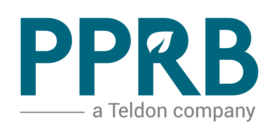
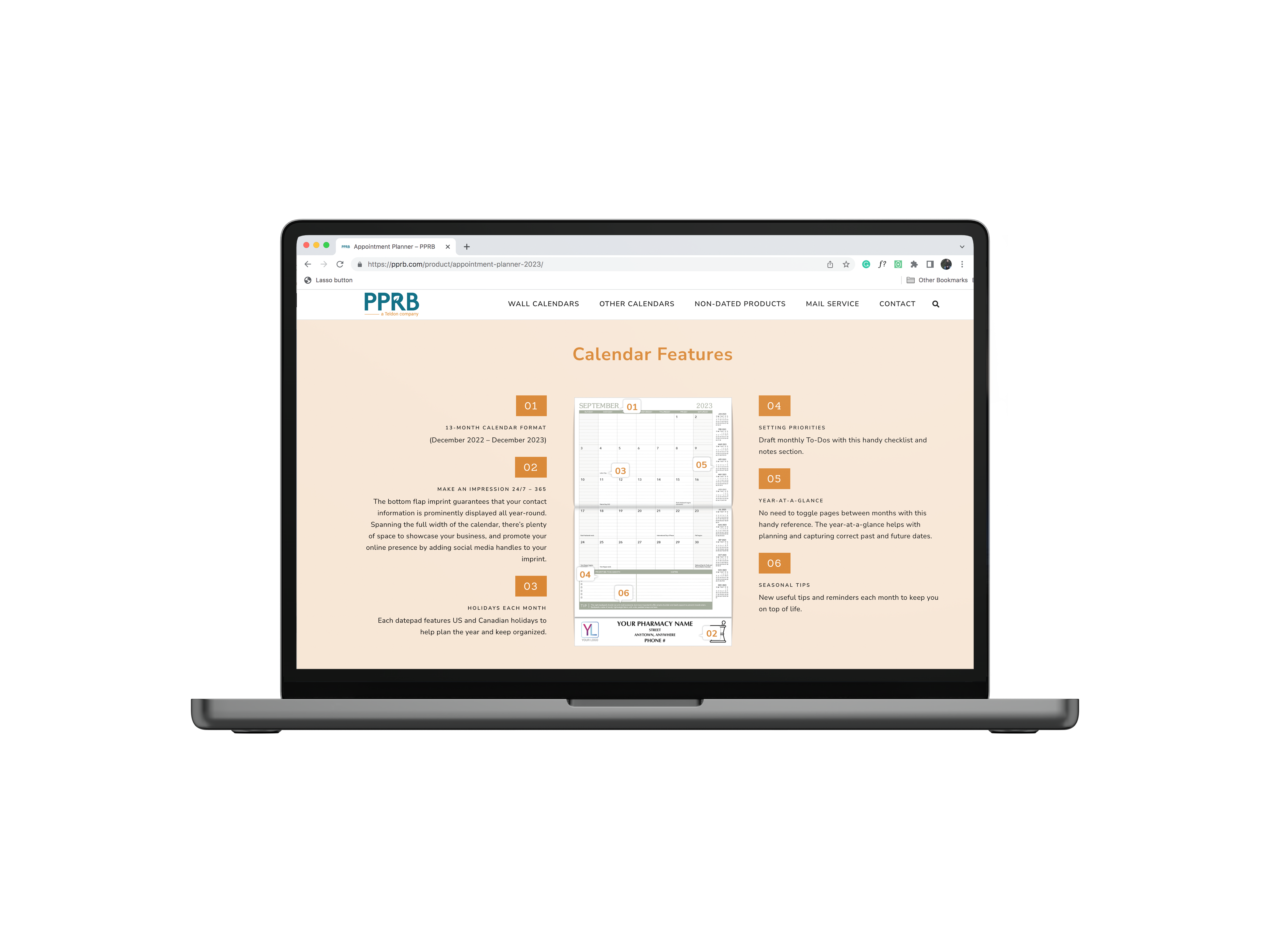
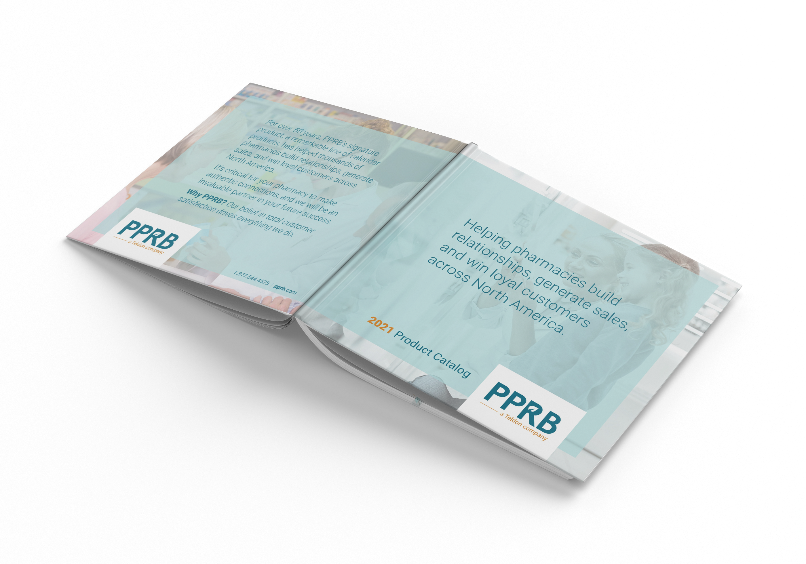
A balanced logo mark that maintains legibility when scaled down, while incorporating a strong presence of common pharmaceutical symbols. Professional yet approachable.
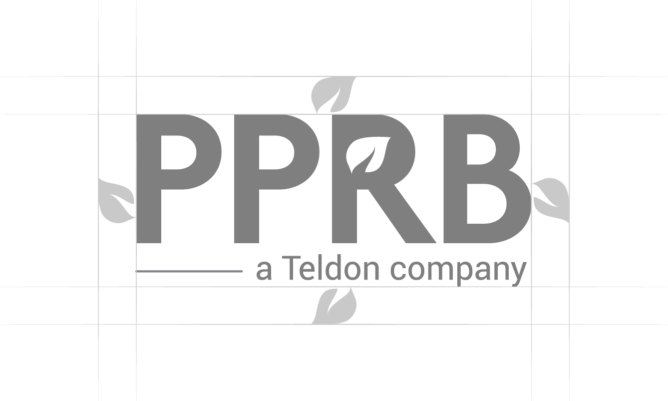
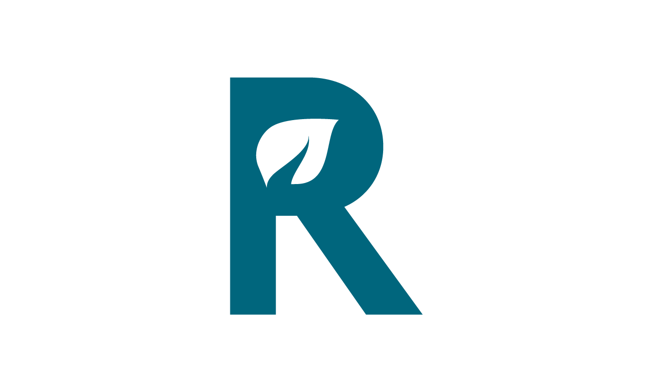
Leaf| A stylized leaf is a symbol of growth and life, accentuating the partnership between PPRB and their clients while adding a friendly touch to an otherwise corporate font combination.
Colour| Teal-blue pairs well with cool and warm tones which makes it versatile in combination with other design elements and is synonymous with the pharmaceutical industry.
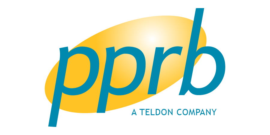
Old Logo
New Logo
Portfolio

Raymond StoriesIllustration, Design, Print

Black MountainBranding, Illustration

Colouring BooksIllustration, Story, Design, Print

Music ArtworkArtwork, Design

Cole's Guitar LessonsBranding

Corporate Calendar LineDesign, Illustration, Print

Themed CalendarsDesign, Illustration, Print

Johnston's PorkDesign, Illustration, Print

Employee ManualsDesign, Illustration, Print

TeldonRebrand, In-house Team Project

Home By Design MagazineMagazine Logo
