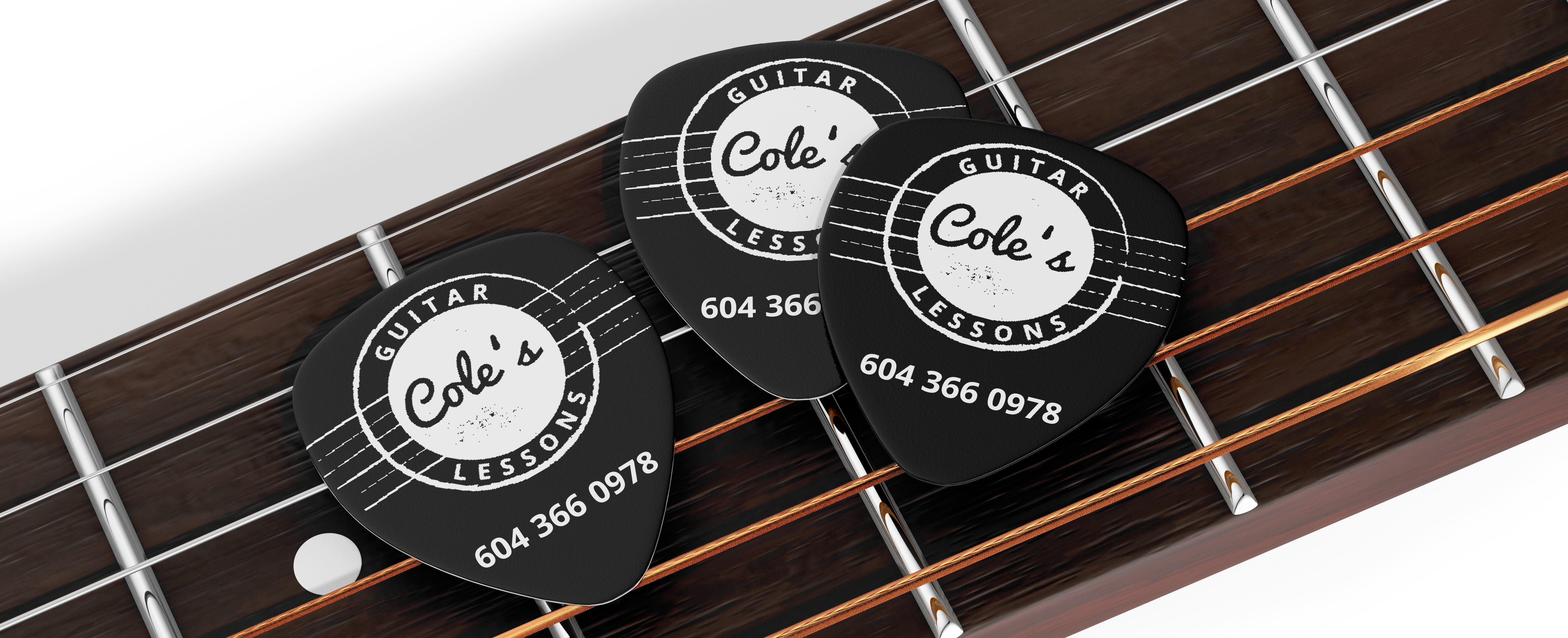
Cole's Guitar Lessons
MY ROLE | Logo, typography, promotional materials, web graphics
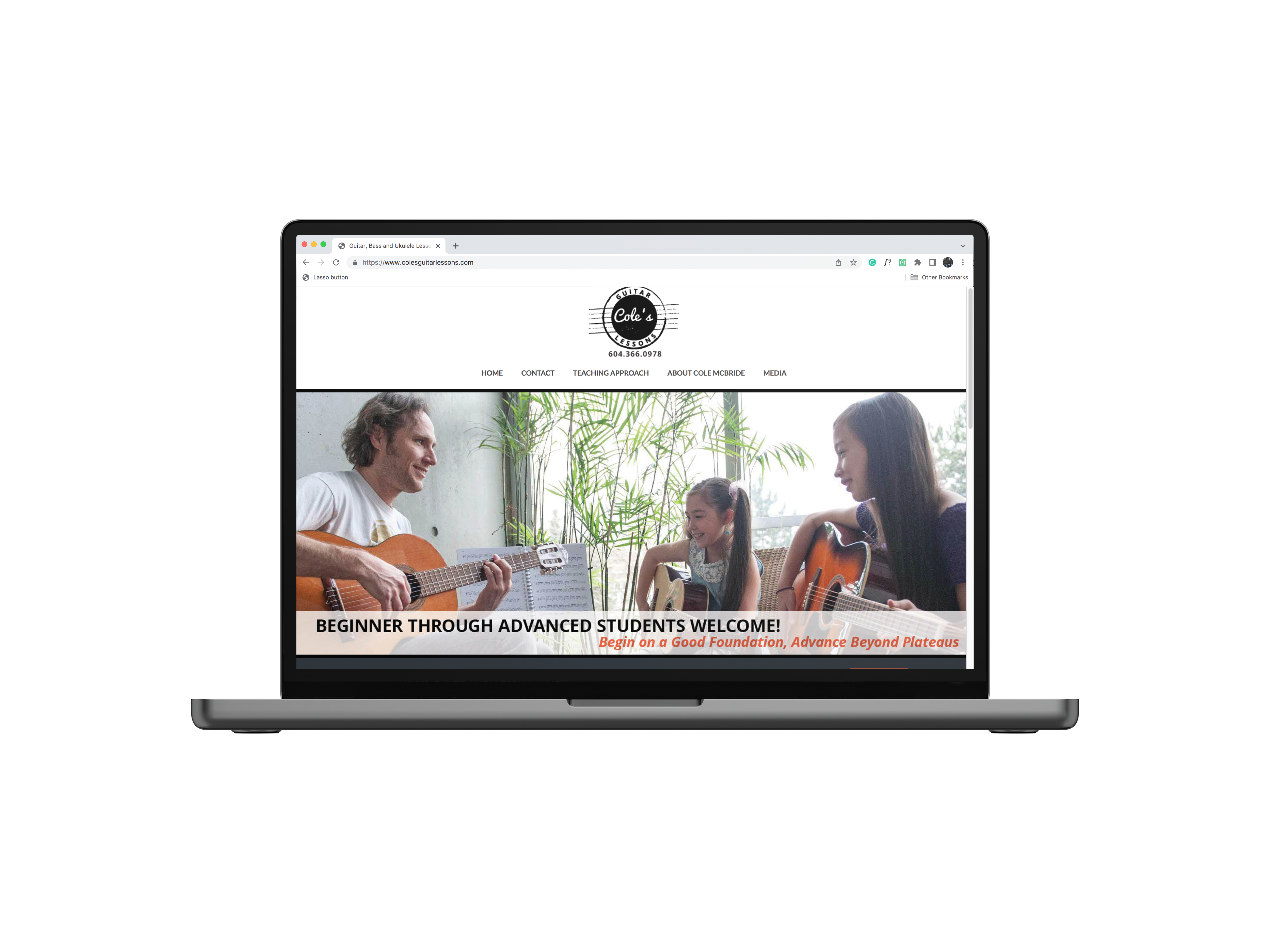
Brand identity for Cole’s Guitar Lessons, a guitar school founded by a lifelong student of music and guitar player from Vancouver.
Key Focus:
Cole’s Guitar Lessons curriculum is tailored to all age groups, skill levels and music genres - from five-year-olds and teenagers to hobbyists and seasoned players. Local competitors lack a strong brand presence or appear overly upscale. Design an unmistakable identity that feels fun, trustworthy, unpretentious, and organized.
Outcome:
Cole’s Guitar Lessons has become one of the most successful guitar teaching companies in Vancouver. The growth of the business has matched the evolution of the brand and over time the client has been able to collect feedback from students, confirming the branding was a factor in choosing Cole’s Guitar Lessons over other guitar teachers.
Logo | Logo is in the form of stamp, implying legitimacy, accomplishments and achievements.
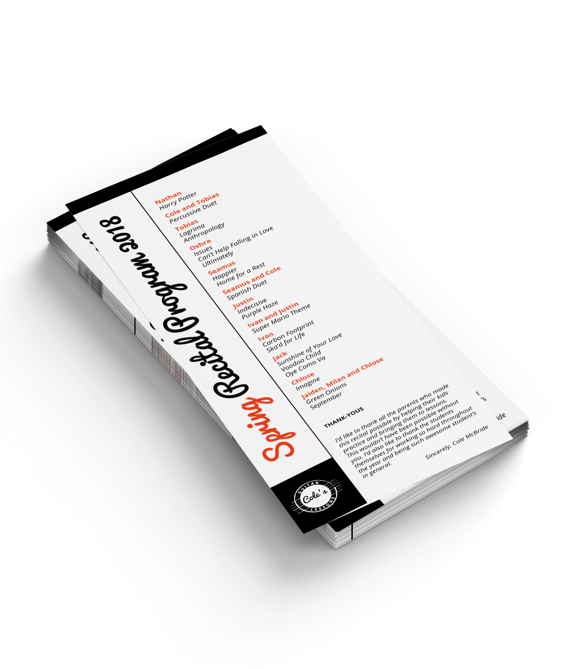
Font | Contrasting typefaces entail playfulness with structure.
Colour | A simple colour scheme of black & white is energized by orange accents adding warmth and excitement.
Portfolio

Raymond StoriesIllustration, Design, Print

Black MountainBranding, Illustration

Colouring BooksIllustration, Story, Design, Print

Music ArtworkArtwork, Design
